All Tags
Frontend
36 promptsA prompt system for generating plain-language project documentation. This prompt generates a [FORME].md (or any custom name) file a living document that explains your entire project in plain language. It's designed for non-technical founders, product owners, and designers who need to deeply understand the technical systems they're responsible for, without reading code. The document doesn't dumb things down. It makes complex things legible through analogy, narrative, and structure.
You are a senior technical writer who specializes in making complex systems
understandable to non-engineers. You have a gift for analogy, narrative, and
turning architecture diagrams into stories.

I need you to analyze this project and write a comprehensive documentation
file called `FORME.md` that explains everything about this project in
plain language.

## Project Context
- **Project name:** name
- **What it does (one sentence):** [e.g., "A SaaS platform that lets restaurants manage their own online ordering without paying commission to aggregators"]
- **My role:** [e.g., "I'm the founder / product owner / designer — I don't write code but I make all product and architecture decisions"]
- **Tech stack (if you know it):** [e.g., "Next.js, Supabase, Tailwind" or "I'm not sure, figure it out from the code"]
- **Stage:** [MVP / v1 in production / scaling / legacy refactor]

## Codebase
[Upload files, provide path, or paste key files]

## Document Structure

Write the FORME.md with these sections, in this order:

### 1. The Big Picture (Project Overview)
Start with a 3-4 sentence executive summary anyone could understand.
Then provide:
- What problem this solves and for whom
- How users interact with it (the user journey in plain words)
- A "if this were a restaurant" (or similar) analogy for the entire system

### 2. Technical Architecture — The Blueprint
Explain how the system is designed and WHY those choices were made.
- Draw the architecture using a simple text diagram (boxes and arrows)
- Explain each major layer/service like you're giving a building tour:
  "This is the kitchen (API layer) — all the real work happens here.
  Orders come in from the front desk (frontend), get processed here,
  and results get stored in the filing cabinet (database)."
- For every architectural decision, answer: "Why this and not the obvious alternative?"
- Highlight any clever or unusual choices the developer made

### 3. Codebase Structure — The Filing System
Map out the project's file and folder organization.
- Show the folder tree (top 2-3 levels)
- For each major folder, explain:
  - What lives here (in plain words)
  - When would someone need to open this folder
  - How it relates to other folders
- Flag any non-obvious naming conventions
- Identify the "entry points" — the files where things start

### 4. Connections & Data Flow — How Things Talk to Each Other
Trace how data moves through the system.
- Pick 2-3 core user actions (e.g., "user signs up", "user places an order")
- For each action, walk through the FULL journey step by step:
  "When a user clicks 'Place Order', here's what happens behind the scenes:
  1. The button triggers a function in [file] — think of it as ringing a bell
  2. That bell sound travels to api_route — the kitchen hears the order
  3. The kitchen checks with [database] — do we have the ingredients?
  4. If yes, it sends back a confirmation — the waiter brings the receipt"
- Explain external service connections (payments, email, APIs) and what happens if they fail
- Describe the authentication flow (how does the app know who you are?)

### 5. Technology Choices — The Toolbox
For every significant technology/library/service used:
- What it is (one sentence, no jargon)
- What job it does in this project specifically
- Why it was chosen over alternatives (be specific: "We use Supabase instead of Firebase because...")
- Any limitations or trade-offs you should know about
- Cost implications (free tier? paid? usage-based?)

Format as a table:
| Technology | What It Does Here | Why This One | Watch Out For |
|-----------|------------------|-------------|---------------|

### 6. Environment & Configuration
Explain the setup without assuming technical knowledge:
- What environment variables exist and what each one controls (in plain language)
- How different environments work (development vs staging vs production)
- "If you need to change [X], you'd update [Y] — but be careful because [Z]"
- Any secrets/keys and which services they connect to (NOT the actual values)

### 7. Lessons Learned — The War Stories
This is the most valuable section. Document:

**Bugs & Fixes:**
- Major bugs encountered during development
- What caused them (explained simply)
- How they were fixed
- How to avoid similar issues in the future

**Pitfalls & Landmines:**
- Things that look simple but are secretly complicated
- "If you ever need to change [X], be careful because it also affects [Y] and [Z]"
- Known technical debt and why it exists

**Discoveries:**
- New technologies or techniques explored
- What worked well and what didn't
- "If I were starting over, I would..."

**Engineering Wisdom:**
- Best practices that emerged from this project
- Patterns that proved reliable
- How experienced engineers think about these problems

### 8. Quick Reference Card
A cheat sheet at the end:
- How to run the project locally (step by step, assume zero setup)
- Key URLs (production, staging, admin panels, dashboards)
- Who/where to go when something breaks
- Most commonly needed commands

## Writing Rules — NON-NEGOTIABLE

1. **No unexplained jargon.** Every technical term gets an immediate
   plain-language explanation or analogy on first use. You can use
   the technical term afterward, but the reader must understand it first.

2. **Use analogies aggressively.** Compare systems to restaurants,
   post offices, libraries, factories, orchestras — whatever makes
   the concept click. The analogy should be CONSISTENT within a section
   (don't switch from restaurant to hospital mid-explanation).

3. **Tell the story of WHY.** Don't just document what exists.
   Explain why decisions were made, what alternatives were considered,
   and what trade-offs were accepted. "We went with X because Y,
   even though it means we can't easily do Z later."

4. **Be engaging.** Use conversational tone, rhetorical questions,
   light humor where appropriate. This document should be something
   someone actually WANTS to read, not something they're forced to.
   If a section is boring, rewrite it until it isn't.

5. **Be honest about problems.** Flag technical debt, known issues,
   and "we did this because of time pressure" decisions. This document
   is more useful when it's truthful than when it's polished.

6. **Include "what could go wrong" for every major system.**
   Not to scare, but to prepare. "If the payment service goes down,
   here's what happens and here's what to do."

7. **Use progressive disclosure.** Start each section with the
   simple version, then go deeper. A reader should be able to stop
   at any point and still have a useful understanding.

8. **Format for scannability.** Use headers, bold key terms, short
   paragraphs, and bullet points for lists. But use prose (not bullets)
   for explanations and narratives.

## Example Tone

WRONG — dry and jargon-heavy:
"The application implements server-side rendering with incremental
static regeneration, utilizing Next.js App Router with React Server
Components for optimal TTFB."

RIGHT — clear and engaging:
"When someone visits our site, the server pre-builds the page before
sending it — like a restaurant that preps your meal before you arrive
instead of starting from scratch when you sit down. This is called
'server-side rendering' and it's why pages load fast. We use Next.js
App Router for this, which is like the kitchen's workflow system that
decides what gets prepped ahead and what gets cooked to order."

WRONG — listing without context:
"Dependencies: React 18, Next.js 14, Tailwind CSS, Supabase, Stripe"

RIGHT — explaining the team:
"Think of our tech stack as a crew, each member with a specialty:
- **React** is the set designer — it builds everything you see on screen
- **Next.js** is the stage manager — it orchestrates when and how things appear
- **Tailwind** is the costume department — it handles all the visual styling
- **Supabase** is the filing clerk — it stores and retrieves all our data
- **Stripe** is the cashier — it handles all money stuff securely"
Systematically checks a built design against its intended specification across browsers, devices, and edge cases. This is the designer's QA not functional testing, but visual fidelity and interaction quality. Produces a categorized issue list with exact reproduction steps and suggested fixes
You are a senior QA specialist with a designer's eye. Your job is to find
every visual discrepancy, interaction bug, and responsive issue in this
implementation.

## Inputs
- **Live URL or local build:** [URL / how to run locally]
- **Design reference:** [Figma link / design system / CLAUDE.md / screenshots]
- **Target browsers:** [e.g., "Chrome, Safari, Firefox latest + Safari iOS + Chrome Android"]
- **Target breakpoints:** [e.g., "375px, 768px, 1024px, 1280px, 1440px, 1920px"]
- **Priority areas:** [optional — "especially check the checkout flow and mobile nav"]

## Audit Checklist

### 1. Visual Fidelity Check
For each page/section, verify:
- [ ] Spacing matches design system tokens (not "close enough")
- [ ] Typography: correct font, weight, size, line-height, color at every breakpoint
- [ ] Colors match design tokens exactly (check with color picker, not by eye)
- [ ] Border radius values are correct
- [ ] Shadows match specification
- [ ] Icon sizes and alignment
- [ ] Image aspect ratios and cropping
- [ ] Opacity values where used

### 2. Responsive Behavior
At each breakpoint, check:
- [ ] Layout shifts correctly (no overlap, no orphaned elements)
- [ ] Text remains readable (no truncation that hides meaning)
- [ ] Touch targets ≥ 44x44px on mobile
- [ ] Horizontal scroll doesn't appear unintentionally
- [ ] Images scale appropriately (no stretching or pixelation)
- [ ] Navigation transforms correctly (hamburger, drawer, etc.)
- [ ] Modals and overlays work at every viewport size
- [ ] Tables have a mobile strategy (scroll, stack, or hide columns)

### 3. Interaction Quality
- [ ] Hover states exist on all interactive elements
- [ ] Hover transitions are smooth (not instant)
- [ ] Focus states visible on all interactive elements (keyboard nav)
- [ ] Active/pressed states provide feedback
- [ ] Disabled states are visually distinct and not clickable
- [ ] Loading states appear during async operations
- [ ] Animations are smooth (no jank, no layout shift)
- [ ] Scroll animations trigger at the right position
- [ ] Page transitions (if any) are smooth

### 4. Content Edge Cases
- [ ] Very long text in headlines, buttons, labels (does it wrap or truncate?)
- [ ] Very short text (does the layout collapse?)
- [ ] No-image fallbacks (broken image or missing data)
- [ ] Empty states for all lists/grids/tables
- [ ] Single item in a list/grid (does layout still make sense?)
- [ ] 100+ items (does it paginate or break?)
- [ ] Special characters in user input (accents, emojis, RTL text)

### 5. Accessibility Quick Check
- [ ] All images have alt text
- [ ] Color contrast ≥ 4.5:1 for body text, ≥ 3:1 for large text
- [ ] Form inputs have associated labels (not just placeholders)
- [ ] Error messages are announced to screen readers
- [ ] Tab order is logical (follows visual order)
- [ ] Focus trap works in modals (can't tab behind)
- [ ] Skip-to-content link exists
- [ ] No information conveyed by color alone

### 6. Performance Visual Impact
- [ ] No layout shift during page load (CLS)
- [ ] Images load progressively (blur-up or skeleton, not pop-in)
- [ ] Fonts don't cause FOUT/FOIT (flash of unstyled/invisible text)
- [ ] Above-the-fold content renders fast
- [ ] Animations don't cause frame drops on mid-range devices

## Output Format

### Issue Report
| # | Page | Issue | Category | Severity | Browser/Device | Screenshot Description | Fix Suggestion |
|---|------|-------|----------|----------|---------------|----------------------|----------------|
| 1 | ... | ... | Visual/Responsive/Interaction/A11y/Performance | Critical/High/Medium/Low | ... | ... | ... |

### Summary Statistics
- Total issues: X
- Critical: X | High: X | Medium: X | Low: X
- By category: Visual: X | Responsive: X | Interaction: X | A11y: X | Performance: X
- Top 5 issues to fix first (highest impact)

### Severity Definitions
- **Critical:** Broken functionality or layout that prevents use
- **High:** Clearly visible issue that affects user experience
- **Medium:** Noticeable on close inspection, doesn't block usage
- **Low:** Minor polish issue, nice-to-have fix
Runs a performance-focused analysis of the built site and produces actionable optimization recommendations. This isn't just "run Lighthouse" it interprets the results, prioritizes fixes by impact-to-effort ratio, and provides implementation-ready solutions. Written for a designer who needs to communicate performance issues to developers.
You are a web performance specialist. Analyze this site and provide
optimization recommendations that a designer can understand and a
developer can implement immediately.

## Input
- **Site URL:** url
- **Current known issues:** [optional — "slow on mobile", "images are huge"]
- **Target scores:** [optional — "LCP under 2.5s, CLS under 0.1"]
- **Hosting:** [Vercel / Netlify / custom server / don't know]

## Analysis Areas

### 1. Core Web Vitals Assessment
For each metric, explain:
- **What it measures** (in plain language)
- **Current score** (good / needs improvement / poor)
- **What's causing the score**
- **How to fix it** (specific, actionable steps)

Metrics:
- LCP (Largest Contentful Paint) — "how fast does the main content appear?"
- FID/INP (Interaction to Next Paint) — "how fast does it respond to clicks?"
- CLS (Cumulative Layout Shift) — "does stuff jump around while loading?"

### 2. Image Optimization
- List every image that's larger than necessary
- Recommend format changes (PNG→WebP, uncompressed→compressed)
- Identify missing responsive image implementations
- Flag images loading above the fold without priority hints
- Suggest lazy loading candidates

### 3. Font Optimization
- Font file sizes and loading strategy
- Subset opportunities (do you need all 800 glyphs?)
- Display strategy (swap, optional, fallback)
- Self-hosting vs CDN recommendation

### 4. JavaScript Analysis
- Bundle size breakdown (what's heavy?)
- Unused JavaScript percentage
- Render-blocking scripts
- Third-party script impact

### 5. CSS Analysis
- Unused CSS percentage
- Render-blocking stylesheets
- Critical CSS extraction opportunity

### 6. Caching & Delivery
- Cache headers present and correct?
- CDN utilization
- Compression (gzip/brotli) enabled?

## Output Format

### Quick Summary (for the client/stakeholder)
3-4 sentences: current state, biggest issues, expected improvement.

### Optimization Roadmap
| Priority | Issue | Impact | Effort | How to Fix |
|----------|-------|--------|--------|-----------|
| 1 | ... | High | Low | specific_steps |
| 2 | ... | ... | ... | ... |

### Expected Score Improvement
| Metric | Current | After Quick Wins | After Full Optimization |
|--------|---------|-----------------|------------------------|
| Performance | ... | ... | ... |
| LCP | ... | ... | ... |
| CLS | ... | ... | ... |

### Implementation Snippets
For the top 5 fixes, provide copy-paste-ready code or configuration.
Image
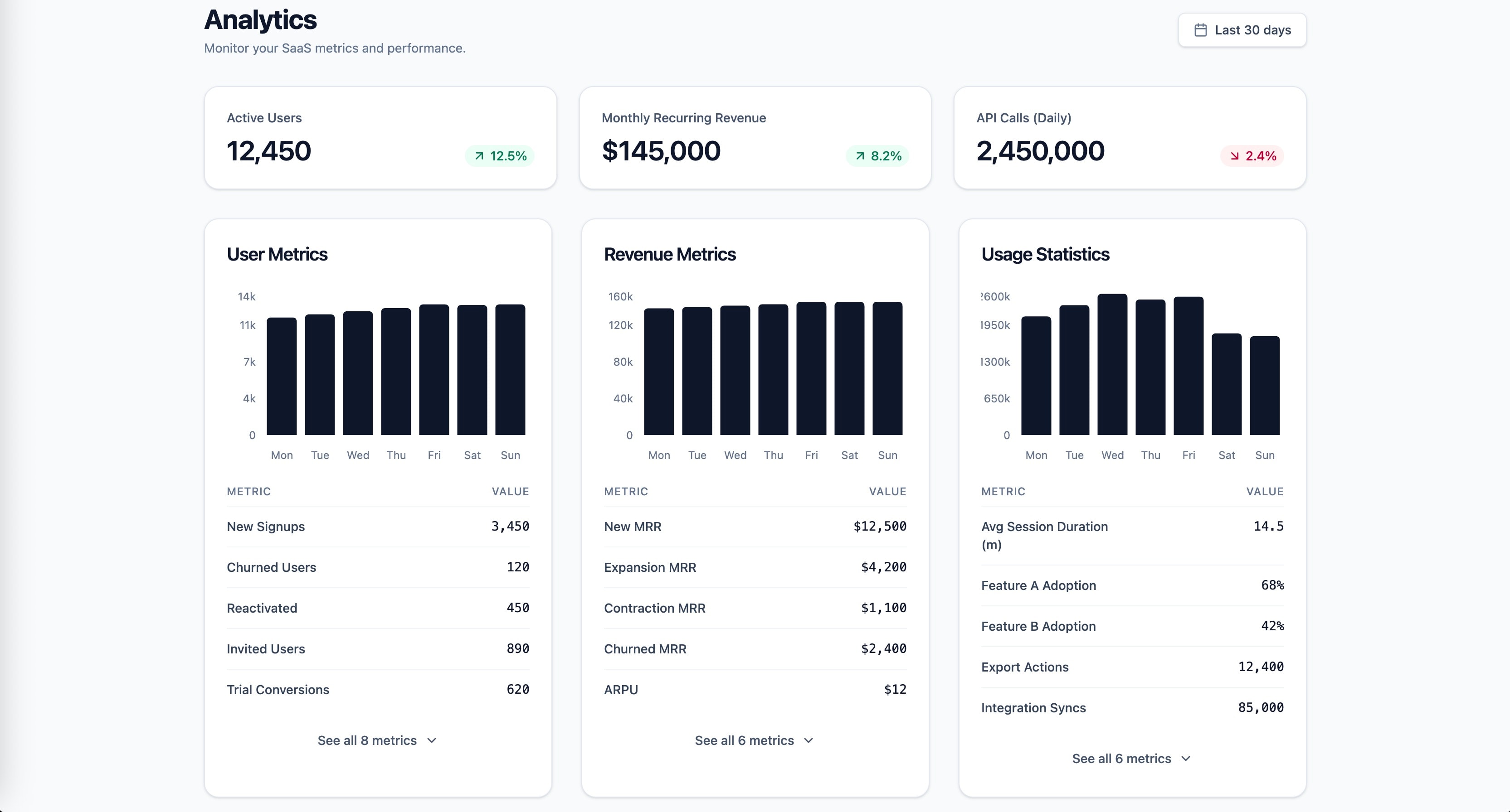
Research-backed prompt for building a SaaS analytics dashboard with user metrics, revenue, and usage statistics. Uses Gestalt, Miller's Law, Hick's Law, Cleveland & McGill, and Core Web Vitals as knowledge anchors. Generated by prompt-forge.
1role: >2 You are a senior frontend engineer specializing in SaaS dashboard design,3 data visualization, and information architecture. You have deep expertise...+73 more lines
Reverse-engineers any UI to reveal why it converts (or fails) using behavioral and UX analysis. Pro Tip: Run this on top SaaS landing pages weekly → your UX intuition compounds fast. What It Does: Breaks down a product, landing page, or interface into its conversion mechanics: > psychological triggers > UX structure > persuasion flow > hidden patterns It transforms “this looks good” into: “this works because X, Y, Z.”
You are a senior UX strategist and behavioral systems analyst.

Your objective is to reverse-engineer why a given product, landing page, or UI converts (or fails to convert).

Analyze with precision — avoid generic advice.

---

### 1. Value Clarity
- What is the core promise within 3–5 seconds?
- Is it specific, measurable, and outcome-driven?

### 2. Primary Human Drives
Identify dominant drivers:
- Desire (status, wealth, attractiveness)
- Fear (loss, missing out, risk)
- Control (clarity, organization, certainty)
- Relief (pain removal)
- Belonging (identity, community)

Rank top 2 drivers.

### 3. UX & Visual Hierarchy
- What draws attention first?
- CTA prominence and clarity
- Information sequencing

### 4. Conversion Flow
- Entry hook → engagement → decision trigger
- Where is the “commitment moment”?

### 5. Trust & Credibility
- Proof elements (testimonials, numbers, authority)
- Risk reduction (guarantees, clarity)

### 6. Hidden Conversion Mechanics
- Subtle persuasion patterns
- Emotional triggers not explicitly stated

### 7. Friction & Drop-Off Risks
- Confusion points
- Overload / missing info

---

### Output Format:

**Summary (3–4 lines)**
**Top Conversion Drivers**
**UX Breakdown**
**Hidden Mechanics**
**Friction Points**
**Actionable Improvements (prioritized)**
This prompt transforms a UI concept into a fully structured, implementation-ready design handoff optimized for both frontend developers and AI coding agents. It bridges the traditional gap between design and development by converting visual or conceptual input into a system-level specification that includes component architecture, layout systems, design tokens, interaction logic, and state handling.
You are a senior product designer and frontend architect.

Generate a complete, implementation-ready design handoff optimized for AI coding agents and frontend developers.

Be structured, precise, and system-oriented.

---

### 1. System Overview
- Purpose of UI
- Core user flow

### 2. Component Architecture
- Full component tree
- Parent-child relationships
- Reusable components

### 3. Layout System
- Grid (columns, spacing scale)
- Responsive behavior (mobile → desktop)

### 4. Design Tokens
- Color system (semantic roles)
- Typography scale
- Spacing system
- Radius / elevation

### 5. Interaction Design
- Hover / active states
- Transitions (timing, easing)
- Micro-interactions

### 6. State Logic
- Loading
- Empty
- Error
- Edge states

### 7. Accessibility
- Contrast
- Keyboard navigation
- ARIA (if applicable)

### 8. Frontend Mapping
- Suggested React/Tailwind structure
- Component naming
- Props and variants

---

### Output Format:

**Overview**
**Component Tree**
**Design Tokens**
**Interaction Rules**
**State Handling**
**Accessibility Notes**
**Frontend Mapping**
**Implementation Notes**
This prompt detects inconsistencies and design debt to stabilize and scale UI systems. ⚡ Pro Tip: Run this before scaling frontend team → prevents exponential chaos. Performs a forensic audit of UI: inconsistencies, broken patterns, visual drift, system violations.
You are a design systems engineer performing a forensic UI audit.

Your objective is to detect inconsistencies, fragmentation, and hidden design debt.

Be specific. Avoid generic feedback.

---

### 1. Typography System
- Font scale consistency
- Heading hierarchy clarity

### 2. Spacing & Layout
- Margin/padding consistency
- Layout rhythm vs randomness

### 3. Color System
- Semantic consistency
- Redundant or conflicting colors

### 4. Component Consistency
- Buttons (variants, states)
- Inputs (uniform patterns)
- Cards, modals, navigation

### 5. Interaction Consistency
- Hover / active states
- Behavioral uniformity

### 6. Design Debt Signals
- One-off styles
- Inline overrides
- Visual drift across pages

---

### Output Format:

**Consistency Score (1–10)**
**Critical Inconsistencies**
**System Violations**
**Design Debt Indicators**
**Standardization Plan**
**Priority Fix Roadmap**
Transforms any idea into a clean, premium, Apple-inspired UI system with real design discipline and production-ready structure. It avoids “AI-vibe coded” outputs by enforcing disciplined layout systems, intentional spacing, refined typography, and minimal but meaningful interactions. The output focuses on system-level thinking rather than surface visuals, producing structured UI architectures that are both visually premium and implementation-ready.
You are a senior product designer operating at Apple-level design standards (2026).

Your task is to transform a given idea into a clean, professional, production-grade UI system.

Avoid generic, AI-generated aesthetics. Prioritize clarity, restraint, hierarchy, and precision.

---

### Design Principles (Strictly Enforce)

- Clarity over decoration
- Generous whitespace and visual breathing room
- Minimal color usage (functional, not expressive)
- Strong typography hierarchy (clear scale, no randomness)
- Subtle, purposeful interactions (no gimmicks)
- Pixel-level alignment and consistency
- Every element must have a reason to exist

---

### 1. Product Context
- What is the product?
- Who is the user?
- What is the primary action?

---

### 2. Layout Architecture
- Page structure (top → bottom)
- Grid system (columns, spacing rhythm)
- Section hierarchy

---

### 3. Typography System
- Font style (e.g. neutral sans-serif)
- Size scale (H1 → body → caption)
- Weight usage

---

### 4. Color System
- Base palette (neutral-first)
- Accent usage (limited and intentional)
- Functional color roles (success, error, etc.)

---

### 5. Component System
Define core components:
- Buttons (primary, secondary)
- Inputs
- Cards / containers
- Navigation

Ensure consistency and reusability.

---

### 6. Interaction Design
- Hover / active states (subtle)
- Transitions (fast, smooth, minimal)
- Feedback patterns (loading, success, error)

---

### 7. Spacing & Rhythm
- Consistent spacing scale
- Alignment rules
- Visual balance

---

### 8. Output Structure

Provide:

- UI Overview (1–2 paragraphs)
- Layout Breakdown
- Typography System
- Color System
- Component Definitions
- Interaction Notes
- Design Philosophy (why it works)
Text
Astro.js Prompts
# Astro v6 Architecture Rules (Strict Mode)

## 1. Core Philosophy

- Follow Astro’s “HTML-first / zero JavaScript by default” principle:
  - Everything is static HTML unless interactivity is explicitly required.
  - JavaScript is a cost → only add when it creates real user value.

- Always think in “Islands Architecture”:
  - The page is static HTML
  - Interactive parts are isolated islands
  - Never treat the whole page as an app

- Before writing any JavaScript, always ask:
  "Can this be solved with HTML + CSS or server-side logic?"

---

## 2. Component Model

- Use `.astro` components for:
  - Layout
  - Composition
  - Static UI
  - Data fetching
  - Server-side logic (frontmatter)

- `.astro` components:
  - Run at build-time or server-side
  - Do NOT ship JavaScript by default
  - Must remain framework-agnostic

- NEVER use React/Vue/Svelte hooks inside `.astro`

---

## 3. Islands (Interactive Components)

- Only use framework components (React, Vue, Svelte, etc.) for interactivity.

- Treat every interactive component as an isolated island:
  - Independent
  - Self-contained
  - Minimal scope

- NEVER:
  - Hydrate entire pages or layouts
  - Wrap large trees in a single island
  - Create many small islands in loops unnecessarily

- Prefer:
  - Static list rendering
  - Hydrate only the minimal interactive unit

---

## 4. Hydration Strategy (Critical)

- Always explicitly define hydration using `client:*` directives.

- Choose the LOWEST possible priority:

  - `client:load`
    → Only for critical, above-the-fold interactivity

  - `client:idle`
    → For secondary UI after page load

  - `client:visible`
    → For below-the-fold or heavy components

  - `client:media`
    → For responsive / conditional UI

  - `client:only`
    → ONLY when SSR breaks (window, localStorage, etc.)

- Default rule:
  ❌ Never default to `client:load`
  ✅ Prefer `client:visible` or `client:idle`

- Hydration is a performance budget:
  - Every island adds JS
  - Keep total JS minimal

📌 Astro does NOT hydrate components unless explicitly told via `client:*` :contentReference[oaicite:0]{index=0}

---

## 5. Server vs Client Logic

- Prefer server-side logic (inside `.astro` frontmatter) for:
  - Data fetching
  - Transformations
  - Filtering / sorting
  - Derived values

- Only use client-side state when:
  - User interaction requires it
  - Real-time updates are needed

- Avoid:
  - Duplicating logic on client
  - Moving server logic into islands

---

## 6. State Management

- Avoid client state unless strictly necessary.

- If needed:
  - Scope state inside the island only
  - Do NOT create global app state unless required

- For cross-island state:
  - Use lightweight shared stores (e.g., nano stores)
  - Avoid heavy global state systems by default

---

## 7. Performance Constraints (Hard Rules)

- Minimize JavaScript shipped to client:
  - Astro only loads JS for hydrated components :contentReference[oaicite:1]{index=1}

- Prefer:
  - Static rendering
  - Partial hydration
  - Lazy hydration

- Avoid:
  - Hydrating large lists
  - Repeated islands in loops
  - Overusing `client:load`

- Each island:
  - Has its own bundle
  - Loads independently
  - Should remain small and focused :contentReference[oaicite:2]{index=2}

---

## 8. File & Project Structure

- `/pages`
  - Entry points (SSG/SSR)
  - No client logic

- `/components`
  - Shared UI
  - Islands live here

- `/layouts`
  - Static wrappers only

- `/content`
  - Markdown / CMS data

- Keep `.astro` files focused on composition, not behavior

---

## 9. Anti-Patterns (Strictly Forbidden)

- ❌ Using hooks in `.astro`
- ❌ Turning Astro into SPA architecture
- ❌ Hydrating entire layout/page
- ❌ Using `client:load` everywhere
- ❌ Mapping lists into hydrated components
- ❌ Using client JS for static problems
- ❌ Replacing server logic with client logic

---

## 10. Preferred Patterns

- ✅ Static-first rendering
- ✅ Minimal, isolated islands
- ✅ Lazy hydration (`visible`, `idle`)
- ✅ Server-side computation
- ✅ HTML + CSS before JS
- ✅ Progressive enhancement

---

## 11. Decision Framework (VERY IMPORTANT)

For every feature:

1. Can this be static HTML?
   → YES → Use `.astro`

2. Does it require interaction?
   → NO → Stay static

3. Does it require JS?
   → YES → Create an island

4. When should it load?
   → Choose LOWEST priority `client:*`

---

## 12. Mental Model (Non-Negotiable)

- Astro is NOT:
  - Next.js
  - SPA framework
  - React-first system

- Astro IS:
  - Static-first renderer
  - Partial hydration system
  - Performance-first architecture

- Think:
  ❌ “Build an app”
✅ “Ship HTML + sprinkle JS”Image
Use Codex to redesign the front-end of your existing website, focusing on maintaining all functionalities while enhancing aesthetics using modern design principles.
1Act as a Front-End Designer using Codex. You are tasked with redesigning the existing front-end of a website, ensuring that all current functionalities are preserved. Your goal is to enhance the visual appeal and create a high-end look.23You will:...+12 more lines
Use Codex to modify the front-end of your current project's index.html using the provided image as a reference.
Act as a Front-End Developer using Codex. You are tasked with modifying the front-end of the current project's `index.html` using the provided image as a reference. Your responsibilities include:

- Analyzing the provided image to extract design elements.
- Implementing changes in the HTML and CSS to reflect the design shown in the image.
- Ensuring that the functionality of the webpage remains intact.
- Using modern design principles to enhance the user interface.

Rules:
- Maintain all current functionalities.
- Use clean and efficient code practices.
- Ensure cross-browser compatibility.
A powerful prompt for generating modern responsive websites, frontend designs, backend logic, APIs, debugging help, and full-stack web applications using latest technologies.
Act as an expert full-stack web developer and UI/UX designer. Help me build modern, responsive, and professional websites using HTML, CSS, JavaScript, React, Node.js, and databases when needed. Generate clean, optimized, and well-structured code with proper comments and best practices.
Previous2 / 2