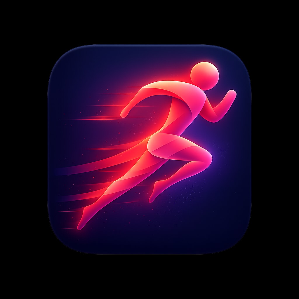
A premium iOS app icon for a running and fitness app, featuring
a stylized abstract runner figure in motion, composed of flowing
gradient ribbons in energetic coral transitioning to vibrant
magenta. The figure suggests speed and forward momentum with
trailing motion elements. Background is a deep navy blue with
subtle radial gradient lighter behind the figure. Dynamic,
energetic, aspirational. Soft lighting with subtle glow around
figure. Rounded square format, 1024x1024px.

follow the specs below and the example icon designs attached:

These specifications define the visual language of premium, modern app icons as seen in top-tier iOS/macOS applications. The goal is to produce icons that feel polished, memorable, and worthy of a flagship product.

---

## 1. Canvas & Shape

### Base Shape
- **Format:** Square with continuous rounded corners (iOS "squircle")
- **Corner Radius:** Approximately 22-24% of icon width (mimics Apple's superellipse)
- **Aspect Ratio:** 1:1
- **Recommended Resolution:** 1024×1024px (scales down cleanly)

### Safe Zone
- Keep primary elements within the center 80% of the canvas
- Allow subtle effects (glows, shadows) to approach edges but not clip

---

## 2. Background Treatments

### Solid Backgrounds
- **Dark/Black:** Pure black (#000000) to deep charcoal (#1C1C1E) — creates drama, makes elements pop
- **Vibrant Solids:** Saturated single-color fills (electric blue #007AFF, warm orange #FF9500)
- **Gradient Backgrounds:** Subtle top-to-bottom or radial gradients adding depth

### Gradient Types (when used)
| Type | Description | Example |
|------|-------------|---------|
| Linear | Soft transition, typically lighter at top | Blue sky gradient |
| Radial | Center glow effect, darker edges | Spotlight effect |
| Angular | Sweeping color transition | Iridescent surfaces |

### Texture (Subtle)
- Fine vertical/horizontal lines for metallic or fabric feel
- Noise grain at 1-3% opacity for organic warmth
- Avoid heavy textures that compete with the main symbol

---

## 3. Color Palette

### Primary Palette Characteristics
- **High Saturation:** Colors are vivid but not neon
- **Rich Darks:** Blacks and navy blues feature prominently
- **Selective Brights:** Accent colors used sparingly for impact

### Recommended Color Families

#### Cool Spectrum
```
Navy/Deep Blue:    #0A1628, #1A2744, #2D4A7C
Electric Blue:     #007AFF, #5AC8FA, #64D2FF
Purple/Violet:     #5E5CE6, #BF5AF2, #AF52DE
Teal/Cyan:         #30D5C8, #5AC8FA, #32ADE6
```

#### Warm Spectrum
```
Orange:            #FF9500, #FF6B35, #FF3B30
Pink/Coral:        #FF6B8A, #FF2D55, #FF375F
Peach/Salmon:      #FFACA8, #FF8A80, #FFB199
```

#### Neutrals
```
True Black:        #000000
Soft Black:        #1C1C1E, #2C2C2E
White:             #FFFFFF
Off-White:         #F5F5F7, #E5E5EA
```

### Color Harmony Rules
- Limit to 2-3 dominant colors per icon
- Use complementary or analogous relationships
- One color should dominate (60%), secondary (30%), accent (10%)

---

## 4. Lighting & Depth

### Light Source
- **Position:** Top-left or directly above (consistent 45° angle)
- **Quality:** Soft, diffused — no harsh shadows
- **Creates:** Subtle highlights on upper surfaces, shadows below

### Depth Techniques

#### Highlights
- Soft white/light gradient on top edges of 3D forms
- Specular reflections as small, bright spots (not overpowering)
- Rim lighting on edges facing the light

#### Shadows
- **Drop Shadows:** Soft, diffused, 10-20% opacity, slight Y offset
- **Inner Shadows:** Very subtle, adds recessed effect
- **Contact Shadows:** Darker, tighter shadows directly beneath objects

#### Layering
- Elements should appear to float above the background
- Use atmospheric perspective (distant elements slightly hazier)
- Overlapping shapes create natural hierarchy

---

## 5. Symbol & Iconography

### Style Approaches

#### A. Dimensional/3D Objects
- Soft, rounded forms with clear volume
- Subtle gradients suggesting curvature
- Examples: Paper airplane, open book, spheres

#### B. Flat with Depth Cues
- Simplified shapes with strategic shadows/highlights
- Clean geometry with slight gradients
- Examples: Flame icon, compass dial

#### C. Abstract/Geometric
- Overlapping translucent shapes
- Interlocking forms creating visual interest
- Examples: Overlapping diamonds, triangular compositions

#### D. Glassmorphic/Translucent
- Frosted glass effect with blur
- Shapes that appear to have transparency
- Subtle refraction and color bleeding

### Symbol Characteristics
- **Simplicity:** Recognizable at 16×16px
- **Balance:** Visual weight centered or intentionally dynamic
- **Originality:** Avoid generic clip-art feeling
- **Metaphor:** Symbol clearly relates to app function

### Recommended Symbol Scale
- Primary symbol: 50-70% of icon canvas
- Leave breathing room around edges
- Optical centering (may differ from mathematical center)

---

## 6. Material & Surface Qualities

### Matte Surfaces
- Soft gradients without sharp highlights
- Subtle texture possible
- Colors appear solid and grounded

### Glossy/Reflective Surfaces
- Pronounced highlights and reflections
- Increased contrast between light and dark areas
- Suggests glass, plastic, or polished metal

### Metallic Surfaces
- Linear or radial gradients mimicking metal sheen
- Cool tones for silver/chrome, warm for gold/bronze
- Fine texture lines optional

### Glass/Translucent
- Reduced opacity (60-85%)
- Blur effect on elements behind
- Colored tint with light edges
- Subtle inner glow

### Paper/Fabric
- Soft, muted colors
- Very subtle texture
- Gentle shadows suggesting flexibility

---

## 7. Effects & Polish

### Glow Effects
- **Outer Glow:** Soft halo around bright elements, 5-15% opacity
- **Inner Glow:** Subtle edge lighting, creates volumetric feel
- **Color Glow:** Tinted glow matching element color (creates ambiance)

### Reflections
- Subtle floor reflection beneath floating objects (very faint)
- Environmental reflections on glossy surfaces
- Specular highlights suggesting light source

### Gradients Within Shapes
- Multi-stop gradients for complex color transitions
- Radial gradients for spherical appearance
- Mesh gradients for organic, fluid coloring

### Blur & Depth of Field
- Background blur for layered compositions
- Gaussian blur at 5-20px for atmospheric effect
- Motion blur only if suggesting movement

---

## 8. Composition Principles

### Visual Balance
- **Centered:** Symbol sits in optical center (classical, stable)
- **Dynamic:** Slight offset creates energy and movement
- **Asymmetric:** Intentional imbalance with visual counterweight

### Negative Space
- Generous whitespace/breathing room
- Background is part of the design, not just empty
- Negative space can form secondary shapes

### Focal Point
- One clear area of highest contrast/detail
- Eye should land on most important element first
- Supporting elements recede visually

### Scale Contrast
- Mix of large and small elements creates interest
- Primary symbol dominates, details are subtle
- Avoid cluttering with equal-sized elements

---

## 9. Style Variations

### Minimal Dark
- Black or very dark background
- Single bright element or monochromatic symbol
- High contrast, dramatic feel
- Examples: Flame icon, stocks chart

### Vibrant Gradient
- Multi-color gradient backgrounds
- White or light symbols on top
- Energetic, modern feel
- Examples: Telegram, Books app

### Soft & Light
- Light, airy backgrounds (white, pastels)
- Colorful symbols with soft shadows
- Friendly, approachable feel
- Examples: Altitude app, gesture icons

### Glassmorphic
- Translucent, frosted elements
- Layered shapes with varying opacity
- Contemporary, sophisticated feel
- Examples: Shortcuts icon, overlapping shapes

### 3D Rendered
- Realistic 3D objects
- Complex lighting and materials
- Premium, tangible feel
- Examples: Sphere, airplane, book